
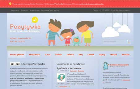
Good looking illustrations and colors drive this design. It’s fairly full of copy which could probably be reduced but it’s generally laid out well enough to be scannable (even if I can’t read it.) Nice limited use of the flash animations at the top and in the footer of the site.




0 Comments