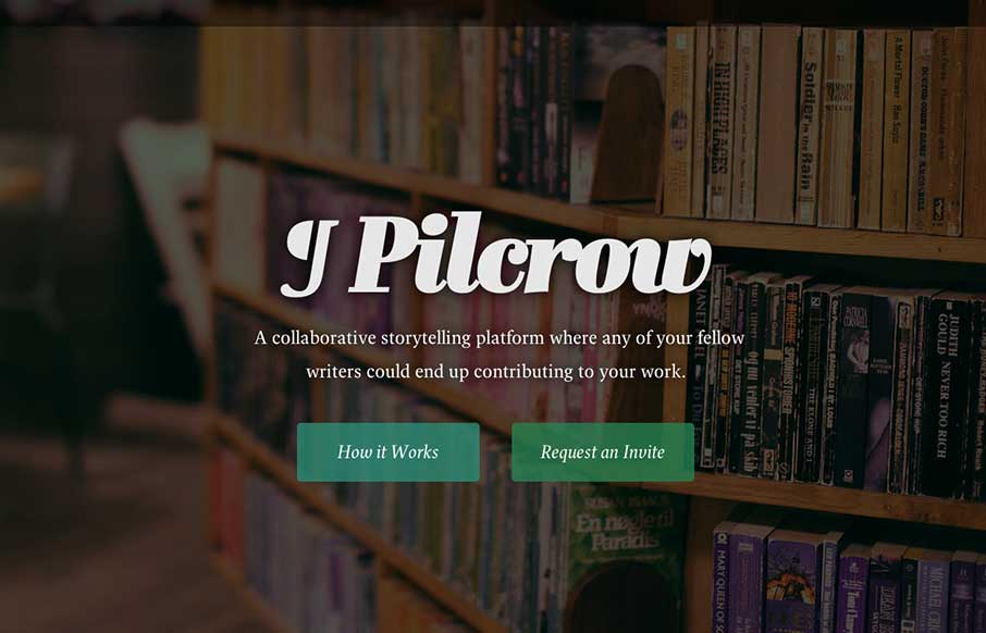
This is a simple landing page app with a few polished touches that push it beyond your typical static (read: boring) coming soon page.
Dive into “How it Works” and you’re greeted with a super smooth animation. We’re talking about plain white boxes here, but the introduction of layering, subtle shadows, and eye-catching typography makes it –again– seem anything but boring. Advancing through the steps is like being carried through the story of how you’ll use the app. Obvious win there as it’s a story writing app. But wait! There’s more! You can totally interact with the “screenshots” by editing text, clicking around on links, and changing from write to read mode. It’s a smart way to rethink the experience of a sneak peek. They’ve managed to give users a way to try out pieces of the app, even before they’ve decided to buy/signup/whatever. At the very end, of the story you’ve been delighted by details, have already interacted with the soon-to-be app, and have nothing to do but click on the lovely “Request an Invite” button. Who wouldn’t?
Last night I launched a landing page for Pilcrow; a collaborative story writing app I'm working on with @benhowdle. http://t.co/c7e6GvtOAW
— Scott Riley (@scott_riley) April 30, 2014


0 Comments