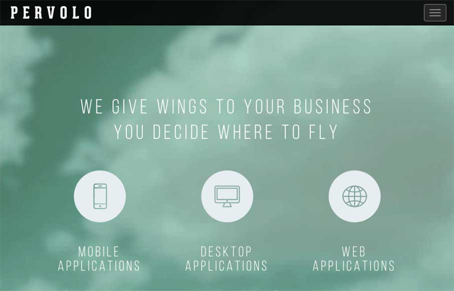
I like the monochromatic approach to the color and the simple line art icons give it a good vibe. I also like the way the header is treated visually as you scroll down a bit.
Glassmorphism: The Transparent Design Trend That Refuses to Fade
Glassmorphism brings transparency, depth, and light back into modern UI. Learn how this “frosted glass” design trend enhances hierarchy, focus, and atmosphere, plus how to implement it in CSS responsibly.


0 Comments