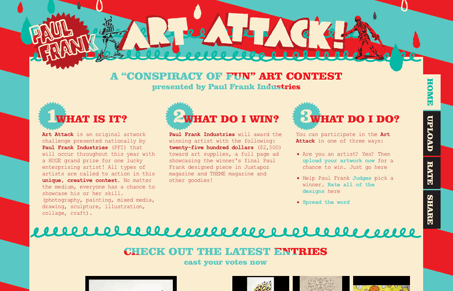
I like the fun feeling of this layout, the colors are loud and the illustrations are cool. It just has a nice ‘pop’ feeling to it, largely due to it being about Paul Frank i’m sure.
Glassmorphism: The Transparent Design Trend That Refuses to Fade
Glassmorphism brings transparency, depth, and light back into modern UI. Learn how this “frosted glass” design trend enhances hierarchy, focus, and atmosphere, plus how to implement it in CSS responsibly.


0 Comments