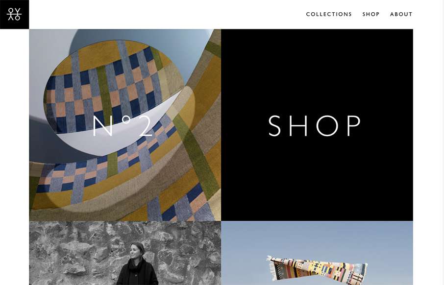
I love the speed of the Oyyo website out of Stockholm. The transitions are quick, and the site is neat and simple.


Glassmorphism: The Transparent Design Trend That Refuses to Fade
Glassmorphism brings transparency, depth, and light back into modern UI. Learn how this “frosted glass” design trend enhances hierarchy, focus, and atmosphere, plus how to implement it in CSS responsibly.


I do agree with the speed and simplicity but I felt particularly frustrated navigating the site. I felt I had no direction, perhaps that is because the cursor was pointer the majority of the time? Also, I had no idea what the purpose of the site was by viewing the home page, who the business was, or where I was supposed to go. Much to be applauded but much to be approved on in regards to UX.
Do you think the images being sort of abstract looking lead to your feeling that way? I felt like once I saw that they were rugs it all sort of came together.