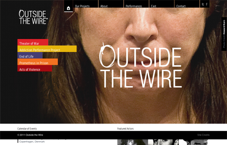
Lately, I’ve been seeing a lot of sites that seem strongly influenced by magazine design. Web design has matured a lot and improvements in our technologies and tools have made expressive design much easier. siteoutsidethewirellc.com isn’t an overly complex design but the strong asymmetry and massive imagery have a definite impact that conveys conflict and unease of the site’s content. So, good to go there.
Whenever large imagery is being loaded, I like to see how thats handled. outsidethecirellc.com has big images, I looked at a few that were in and around 275k. Thats nothing to sneeze at but still pretty respectable considering they size up to fill my HD monitor. What I find interesting about the treatment of the imagery is that each image is overlaid by a small light grid pattern (a separate image in another div). In my estimation, this serves three purposes. One, it creates an interference pattern that helps to hide pixilation as the background image is sized above 100%, allowing for smaller images to be loaded and they blown up. Two, it acts as a photography treatment that is essentially procedural. Any image loaded behing the grid will share a common look and feel and will integrate well with the site. Three, it looks a little like television, emphasizing the drama and performance nature of the site’s content and subject matter.
A photo treatment is perhaps a small detail but I think that in this case it serves as an example of how a small decision can be both an elegant solution to multiple problems (both technical and artistic) and an anchor for an overarching concept. I’ll just be honest and say that this site is not my favorite in our gallery. Don’t get me wrong, I like it. But what I love about it is how a small 1k .png grid can make all the difference. 🙂


0 Comments