
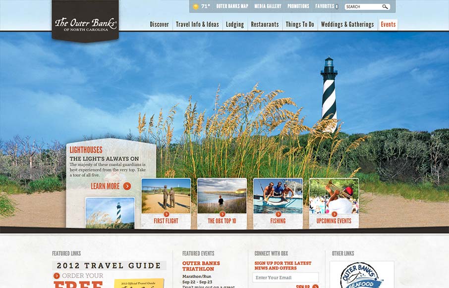
Really slick vacation marketing site for The Outer Banks of NC. I like the hero area slide show’s interactions, they’re quite involved but they look tempting to click around on. The mid area feels a bit cramped with the 4 columns at first but they’ve left it airy enough to make it work. I also dig the little map on the subpages to show you where you are geographically while looking at particular content/places.


Fitts’s Law: Why the Easy Button Wins
Large, close targets are faster to hit than small, distant ones, that’s Fitts’s Law. A look at the 1954 rule behind buttons, prime and magic pixels, thumb zones, and dark patterns.


0 Comments