
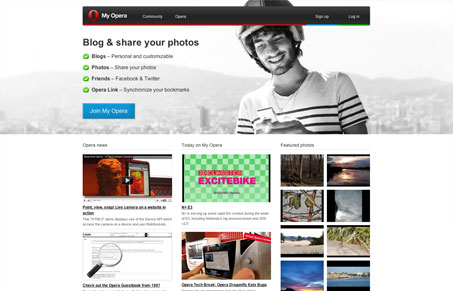
Interesting site for the Opera Community, more interesting still is the responsive design the site has been given. It’s a very simply realized design but it’s a really nice example of design for different screen sizes. I’m not wild about the photo they used but if you watch the dude in the foreground and the background it’s neat to see how they’ve split up the photo to work so well.




0 Comments