oliverrussell.com

http://oliverrussell.com/

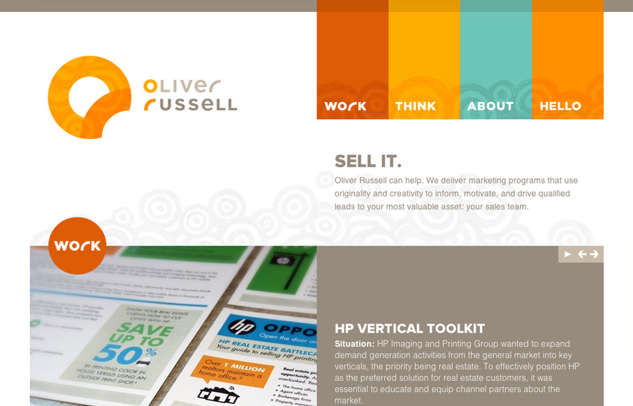
I like the two main column layout for this website. The use of the circles and overall blocky feeling of the design makes for a nice contrast, especially with the circular swirly pattern behind the main elements.

http://oliverrussell.com

The responsive design for this site is pretty well executed visually too. The flip of the main nav elements to horizontal ext to vertical is interesting. There’s even a slight animation on the logo that makes it look like it squishes to a smaller to larger size. Very clever stuff.

0 Comments

Submit a Comment

Your email address will not be published. Required fields are marked *

News & Articles

Looking Fast: The Art of Website Speed Perception

Looking Fast: The Art of Website Speed Perception

In the web world, technical speed and user perception matter. By improving design for a faster appearance, you boost conversions and stand out online. Speed isn’t just loading time; it’s perception.

Designing for Errors: Creating User-Friendly Contingency Plans

Designing for Errors: Creating User-Friendly Contingency Plans

Contingency Design hinges on empathy, understanding user frustration, and transforming errors into positive impressions. By embracing these principles, you enhance user experiences, retain customers, and boost revenue in the competitive digital landscap