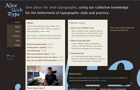
Really nice multi-column design. I like the nav that stays static as you scroll down the page and how the 2-3 columns to the right start to break the past posts up into smaller blocks. The colors are also nice, I love the blue with the reddish/brown background.
Glassmorphism: The Transparent Design Trend That Refuses to Fade
Glassmorphism brings transparency, depth, and light back into modern UI. Learn how this “frosted glass” design trend enhances hierarchy, focus, and atmosphere, plus how to implement it in CSS responsibly.


0 Comments