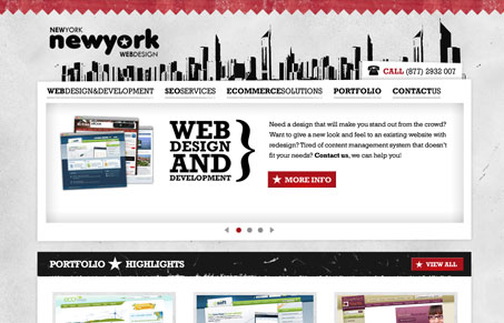
I like the colors and subtle textures in this design. The typography holds together pretty well too. It’s a fairly straightforward website design, the fact that each page is pretty much the same just with some different large graphics in the javascript slideshow setup makes it easy to take in by a client I would imagine.
Glassmorphism: The Transparent Design Trend That Refuses to Fade
Glassmorphism brings transparency, depth, and light back into modern UI. Learn how this “frosted glass” design trend enhances hierarchy, focus, and atmosphere, plus how to implement it in CSS responsibly.


0 Comments