
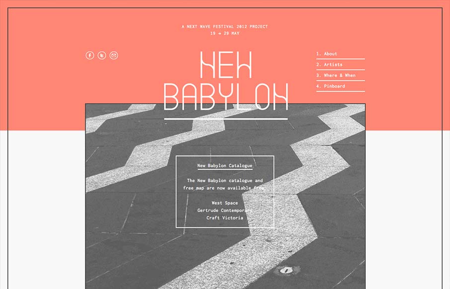
I like the way the lines used in this design and the big blocks of color or no color work together. Even into the type it feels unified yet unbalanced. Rich yet minimal that’s how i’d describe this design. Lovely.


Fitts’s Law: Why the Easy Button Wins
Large, close targets are faster to hit than small, distant ones, that’s Fitts’s Law. A look at the 1954 rule behind buttons, prime and magic pixels, thumb zones, and dark patterns.


0 Comments