via @MattStevensCLT
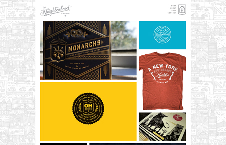
“Today, playing the role of guy that makes me feel inadequate, Mr. @Curtis_Jinkins & his new site http://www.neighborhood-studio.com/ sweet stuff, dude.”
Neighborhood-studio.com is blank slate design. Every element is crisp and tight and subdued. Even the crazy drawing background fades into a pleasant, soft grey when looking at the color rich project imagery. Add a few bright css3 transitions and you’ve got a little bit o’ magic. In a lot of ways it has a design-for-designers aesthetic but is very friendly and approachable. I just like it.


0 Comments