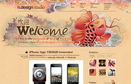
Wonderfully illustrated design. I love the colors and detail work in this website. I think I like the little icons on the main nav at the top most, and the footer really catches my eye as something that’s really nicely done. There’s a really in depth post about the redesign here, that frankly covers it much better than anyone else could.
Glassmorphism: The Transparent Design Trend That Refuses to Fade
Glassmorphism brings transparency, depth, and light back into modern UI. Learn how this “frosted glass” design trend enhances hierarchy, focus, and atmosphere, plus how to implement it in CSS responsibly.


Top notch work. Absolutely gorgeous.