
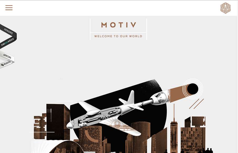
Sometimes architect’s websites can be crazy and very “flash” like. Remember that? I’m still seeing things like that, particularly in this industry for some reason… The Motive site skirts the line with the page loader on each section and the atypical layout scheme. However I find it refreshing feeling, it’ has a modern deco vibe that I’m really digging. Great looking aesthetic here.


Fitts’s Law: Why the Easy Button Wins
Large, close targets are faster to hit than small, distant ones, that’s Fitts’s Law. A look at the 1954 rule behind buttons, prime and magic pixels, thumb zones, and dark patterns.


0 Comments