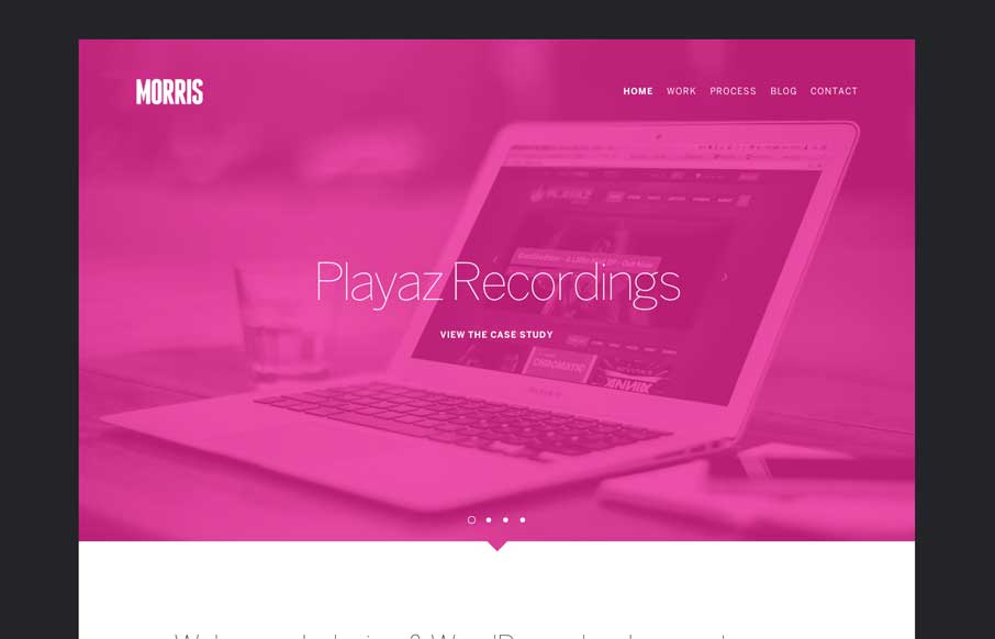
Cool vibe to this site design for Morris. I like the colors and they way the elements are presented. It feels kind of fresh and has that “mobile” vibe to it visually. Pretty neat.


The Call to Action, Revisited
The Call to Action hasn’t changed in a decade, but the bar has. A fresh look at prominence, copy, mobile tap targets, and accessibility, with lessons from three major design systems.


🙂
Thanks for the support guys