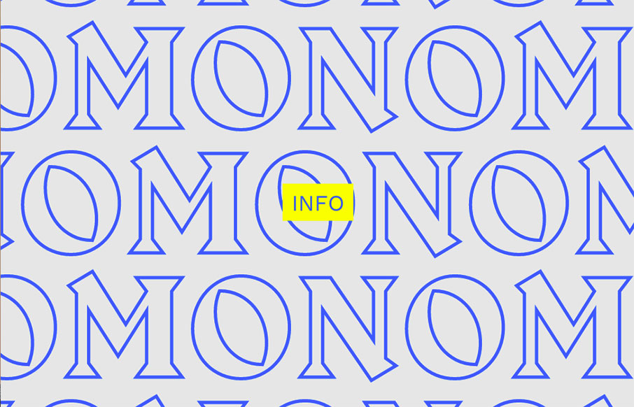
Kind of a crazy ass website. I’m enjoying it tremendously even though it largely goes against most of my gut telling me the UX is bad. What do you all think?
Glassmorphism: The Transparent Design Trend That Refuses to Fade
Glassmorphism brings transparency, depth, and light back into modern UI. Learn how this “frosted glass” design trend enhances hierarchy, focus, and atmosphere, plus how to implement it in CSS responsibly.


0 Comments