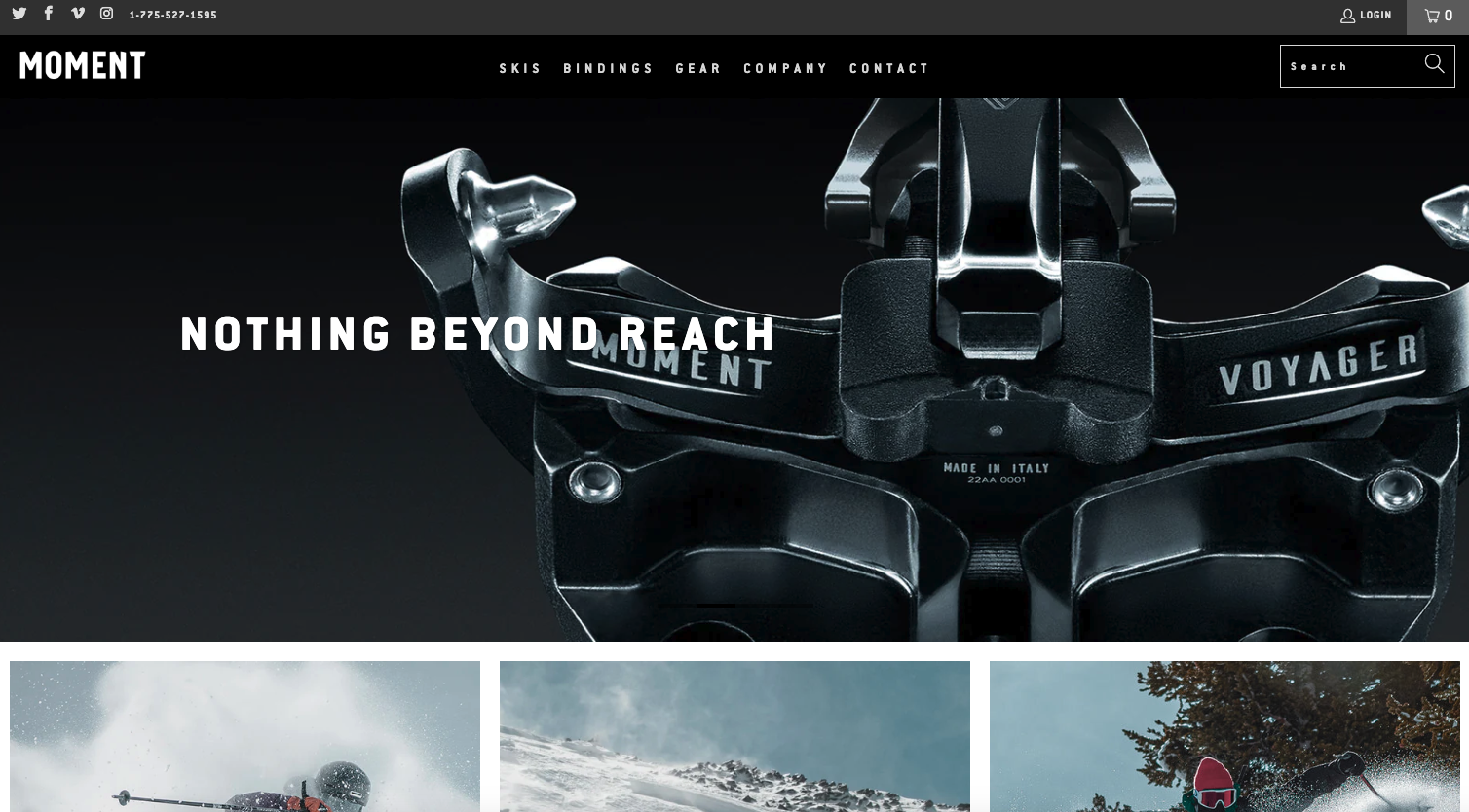
Moment Skis has a modern feeling/simple design that adds personality to their content and makes their products look appealing. They’ve used a simple two-column layout but made it interesting with nice colors, great images, and some subtle CSS effects. The result is a clean and creative interface that looks fantastic.
Glassmorphism: The Transparent Design Trend That Refuses to Fade
Glassmorphism brings transparency, depth, and light back into modern UI. Learn how this “frosted glass” design trend enhances hierarchy, focus, and atmosphere, plus how to implement it in CSS responsibly.


0 Comments