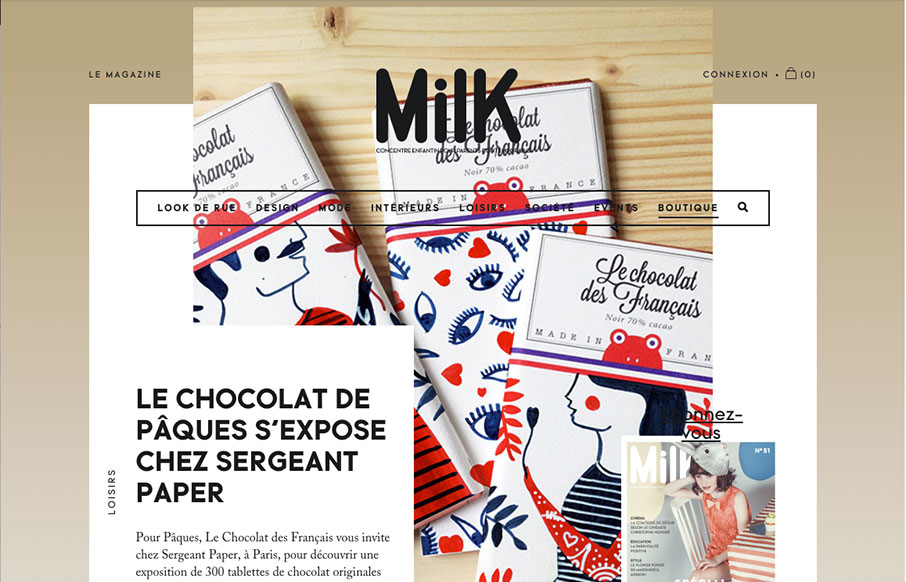
Slick yet simple approach to the layout for Milk Magazine. I love how the main/top section has some overlapping elements like that, then the nav slides up and locks into place as you scroll down. It all fits together and “feels” very purposeful.
Mastering Grids in UI Design: The Backbone of Visual Harmony
A modern guide to UI design grids, learn how to build flexible 12-column and 4-column systems, master margins, gutters, and modules, and apply today’s responsive layout best practices.


0 Comments