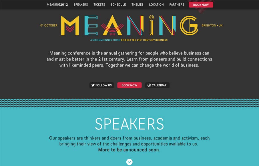
Nice clean conference website design. I like the mix of the green and dark grey. The “book now” button is very clearly/obvious by being red and they also designed that little triangle pattern behind it. The sections are clearly marked with wavy lines and different color blocks. It’s a great study in clean and clear design for a conference website.
Glassmorphism: The Transparent Design Trend That Refuses to Fade
Glassmorphism brings transparency, depth, and light back into modern UI. Learn how this “frosted glass” design trend enhances hierarchy, focus, and atmosphere, plus how to implement it in CSS responsibly.


0 Comments