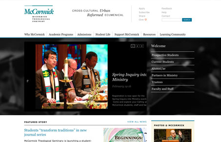
Submitted by Lizy Gershenzon, @ejgershenzon. Designer.
There’s something to be said for making a nice clean layout and using web safe fonts how they’re supposed to be used. This is just a nicely done, workhorse type design in my opinion. Good grid and underlying structure, this site will last the client a long time with updates and content changes. I also like how the logo just seems to fit so well with the layout or the layout just echos the logo.


Thanks for the kind critique. We had a lot of fun working with the McCormick team to create a solution that is easy to keep fresh and consistent as they grow.