
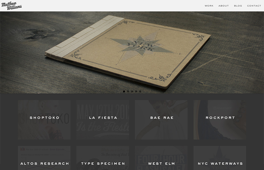
Maybe it’s the colors or the photos that are used in the main slideshow but this design just feels “hand-made” (like, I know it was made by someone, but i’m talking about that hand-made aesthetic). It’s really well done, with the attention paid to the imagery in the slideshow and smaller portfolio blocks. There’s tons of work put into each portfolio detail too. Great job on this.


Fitts’s Law: Why the Easy Button Wins
Large, close targets are faster to hit than small, distant ones, that’s Fitts’s Law. A look at the 1954 rule behind buttons, prime and magic pixels, thumb zones, and dark patterns.


0 Comments