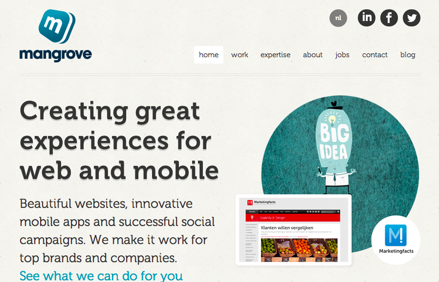
I really like the simple typography and strong asymmetrical composition of mangrove.com. The site has a minimal, but judicious application of color that leaves plenty of room for their content. Coupled with simple, yet sophisticated interactions, mangrove.com is the complete package.


The Call to Action, Revisited
The Call to Action hasn’t changed in a decade, but the bar has. A fresh look at prominence, copy, mobile tap targets, and accessibility, with lessons from three major design systems.


0 Comments