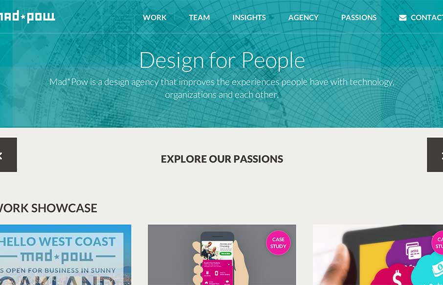
I like how Mad*Pow out of Portsmouth, NH has used their slider in a different fashion – less big image, more information. Also like how most of the coloring for the site comes from their examples of work – build a canvas, fill it up!
Glassmorphism: The Transparent Design Trend That Refuses to Fade
Glassmorphism brings transparency, depth, and light back into modern UI. Learn how this “frosted glass” design trend enhances hierarchy, focus, and atmosphere, plus how to implement it in CSS responsibly.


0 Comments