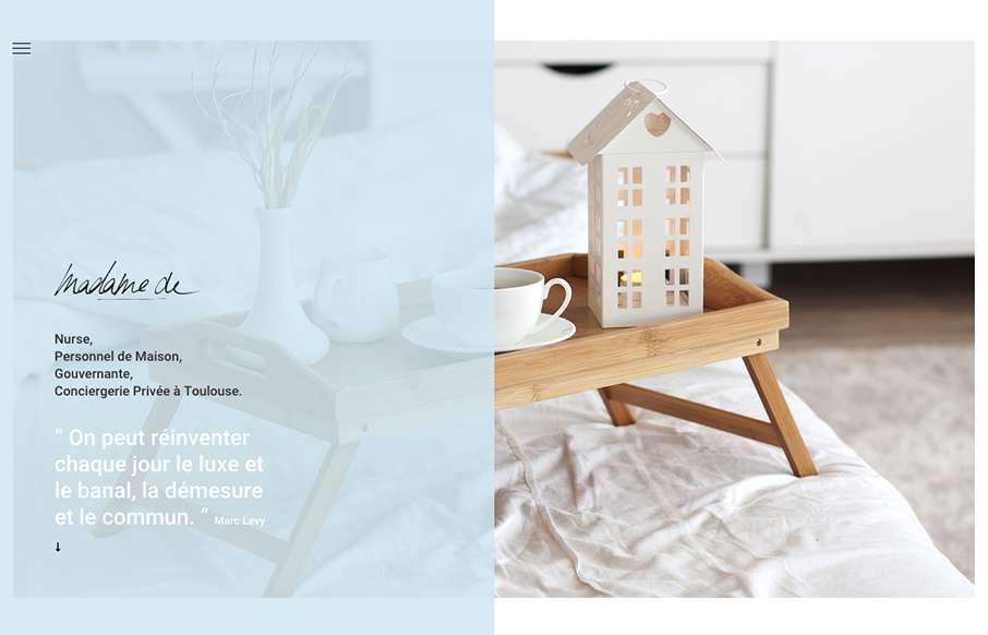
Pretty cool look to this website, it’s soft and open feeling. I also really love the placement of the hamburger icon inside the top left corner of that darker shade/color box. It draws my eye there almost instantly.
Glassmorphism: The Transparent Design Trend That Refuses to Fade
Glassmorphism brings transparency, depth, and light back into modern UI. Learn how this “frosted glass” design trend enhances hierarchy, focus, and atmosphere, plus how to implement it in CSS responsibly.


0 Comments