
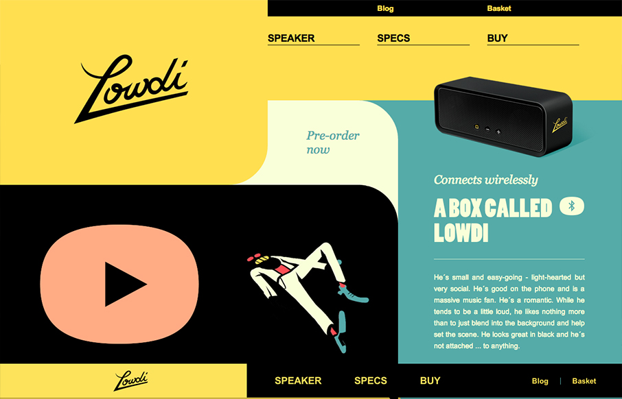
The design is a nice example of an asymmetrical design that leads to a symmetrical as you scroll down. I like that balance. Nice colors and interactions make this a well rounded design that’s going to be memorable.


Fitts’s Law: Why the Easy Button Wins
Large, close targets are faster to hit than small, distant ones, that’s Fitts’s Law. A look at the 1954 rule behind buttons, prime and magic pixels, thumb zones, and dark patterns.


0 Comments