

What a great website to study the different screen size experiences with. I love the three major size designs here. The wider has the nice nav inline next to the logo area and then as you scale in it slides under the logo. With the final iPhone sized screen having the navigation taking more prominence. I really dig that decision since when you go here on your phone you’ll basically either want to get the address info or check up on some sub page content. Beautifully designed yet simple website for this art gallery.

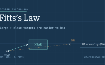
Fitts’s Law: Why the Easy Button Wins
Large, close targets are faster to hit than small, distant ones, that’s Fitts’s Law. A look at the 1954 rule behind buttons, prime and magic pixels, thumb zones, and dark patterns.

I really like the way the responsive is handled for this site… except for the navigation. It would be better if it was at the bottom or in a dropdown of some sort. As it is, each page is just logo and main navigation, and you have to scroll down to get to any content. It would also be smart to bump up the size of the text in the footer for touchscreen devices, the links are a little hard to tap. It’s good to keep the Apple guidelines of 44×44 for tappable buttons in mind, even for just text links. http://stackoverflow.com/questions/1928991/minimum-sensible-button-size-on-iphone