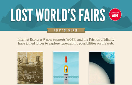
The Lost World’s Fairs website and subsequent mini-sites or pages designed by some of the web’s top designers and developed by the awesome guys at Paravel. The reasoning behind this whole website is because IE9 now supports the .woff font format, so they decided to explore the possibilities of type on the web. Here’s a brief quote from Trent Walton’s blog about the project:
A while back, Jason Santa Maria called to see if I’d be interested in joining him on a team with Frank Chimero & Naz Hamid. After confirming my participation, as well as the fact that this wasn’t a practical joke, I learned that our mission was to create 3 web poster sites that showcase WOFF and how well IE9 supports it. – Full post here
This is the first of three sites we’ll review for the Lost World’s Fairs project. This is the main website that funnels you to the other three, designed by Jason Santa Maria, Frank Chimero & Naz Hamid respectively.


I think Atlantis is my favorite. I enjoyed the typographic ‘exploration’ that Chimero gave us by scrolling through his design.
These top designers are great guys for showing these new capabilities off and inspiring us in the process.
Atlantis is my favorite too, though it’s really hard to actually pick a favorite here.