
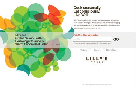
Really great, single page, single purpose website/page. It’s to get you to sign up for the email delivery of the receipts service. Very cleverly design, the big bold background image makes you focus on the blog link, while you are really quickly drawn to the sign up box.


Fitts’s Law: Why the Easy Button Wins
Large, close targets are faster to hit than small, distant ones, that’s Fitts’s Law. A look at the 1954 rule behind buttons, prime and magic pixels, thumb zones, and dark patterns.


0 Comments