
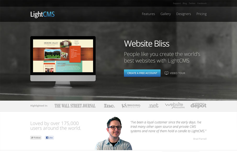
I’ve followed LightCMS for a while and they always impress me with their product and they pack a nice punch with their product site too. The best part of this site is revealed as you scroll down, the offset images and asymmetrical look is just nice. They focus well on telling what you need, they’re very good at this. Then you’re hit with a nice usable footer. Well done.


Fitts’s Law: Why the Easy Button Wins
Large, close targets are faster to hit than small, distant ones, that’s Fitts’s Law. A look at the 1954 rule behind buttons, prime and magic pixels, thumb zones, and dark patterns.


0 Comments