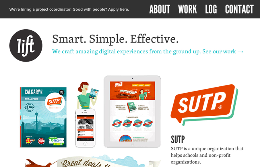
Damn, this is a cool site. Mixture of multiple illustration styles is awesome, as is the overall experience. liftinteractive.com has everything. The typography is tight and varied (if maybe a little uninspired), and structured beautifully. The interactions are surprising and fun. I especially like how all of the transitions are treated. Every movement or transition has been softened in some way to demonstrate the movement from one piece of content to the next. Transitions have been subtly animated. Page changes aren’t just flashes of white. Instead, they take a quick beat to fade in an out. Its an awesome effect and has the added benefit of helping a viewer orient his or her self.
My favorite little eye candy, wizbangery is on the log page. The hover transition for the books is stellar. The 3d effect is gorgeous and gives the impression that I’m about to read something very important. People, we now have an effect that gives production value. This is the ‘car chase scene and resulting exploding fireball’ of web design!
Well done.


0 Comments
Trackbacks/Pingbacks