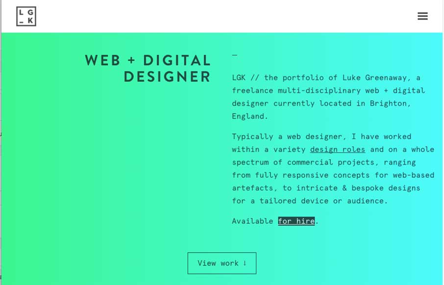
Really like this portfolio site from Luke Greenway out of Brighton, UK. It’s smooth and classy? – can’t find better words for to describe that right now. Also starting to like this trend of sticky headers that reveal in a different color when you scroll down (white to teal-ish for LGK’s site).
Glassmorphism: The Transparent Design Trend That Refuses to Fade
Glassmorphism brings transparency, depth, and light back into modern UI. Learn how this “frosted glass” design trend enhances hierarchy, focus, and atmosphere, plus how to implement it in CSS responsibly.


0 Comments