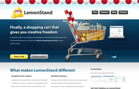
Submitted by Danny Halarewich, @lemonstand Designer & Developer.
I designed the site, so of course I think it’s pretty awesome 🙂
Look for the birdie and picture on the shelf in the header area.Site uses some CSS3 and browser specific CSS3 for rounded corners and box shadows.
This is a very visually appealing site. I like the dark background used to accentuate the product overview, and the use of yellow for the call to action buttons ties in well with the brand. Also, the site layout does well to lead the viewer’s eye down the page, promoting the blog and encouraging visitors to check out the rest of the website.
The “hover-tweet” effect on the twitter bird is kind of neat, but I wonder if it might make more sense to just have it visible all the time. Also, the grass and soil footer looks cool, but I’m not sure what it has to do with the theme.


Thanks!
At the moment, we don’t feel our latest tweet is terribly crucial to anything, so we decided to get a little creative with it.
The grass footer is related to the lemonade stand concept. You know… summer… lemonade stands… etc.
Cheers