
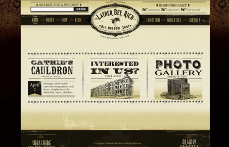
I love the weathered almost leather look to the elements in this design. The typography is also really fun. There’s some small(ish) issues with some of the navigation elements being a bit small, but I can overlook that for the fun of this layout. I also like the background in the drop-down navigation design.




0 Comments