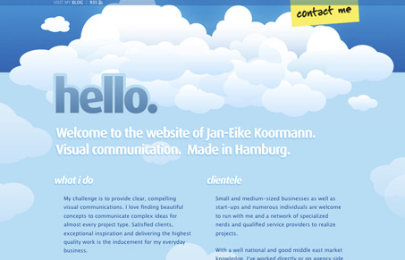
Alright I hate to be negative but there are a lot of things going on here that bother me so here goes.. I’m not a huge fan of the clouds – I guess I feel like I’m about to be introduced to some new web app but maybe it just has a similar setup to a lot of those generic 2.0 sites I’ve seen recently – or maybe I’m just clouded out? One thing that I also am not a fan of is having the blog off of the site when it wouldn’t be too hard to integrate. I also think it’s unnecessary to be linking up the terms under expertise to Wikipedia definitions.
It’s going to sound mean but I’m also suggesting that this person look into better English translation.
On the other side of things the bird pooping at the bottom of the page is cute/quirky and shows a little bit of personality that I look for in personal sites. Maybe if that idea were carried more into the rest of the page it would be more interesting?


Thanks for your personal review Julia! I guess you never been to Hamburg, that’s the reason why you didn’t get the point with the clouds… 😉
The blog isn’t well integrated yet, because it will be soon transported to another system. I’m also very thankful, that you pointed out that there are some translation/spelling mistakes in the website. This should not happen and will be corrected asap.
But in my opinion your short review does not sound very professional. You should foster constructive design criticism and not try to make jokes which are not funny. What do you think? And don’t hate to be negative, it’s just one (your) personal opinion…
Well, i actually loved the clouds 🙂 Also, contact form looks great, and nicely drops from top, footer pic very nice also… great job 🙂