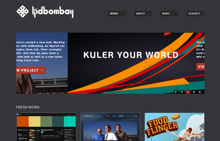
Really really great simple clean design here on Kidbombay. Love the textures, the @font-face use (keeps it clean) and the visual hierarchy is well done. Clear color used simply to denote calls to action and the images really stand out off the page. Really great design here!
Glassmorphism: The Transparent Design Trend That Refuses to Fade
Glassmorphism brings transparency, depth, and light back into modern UI. Learn how this “frosted glass” design trend enhances hierarchy, focus, and atmosphere, plus how to implement it in CSS responsibly.


0 Comments