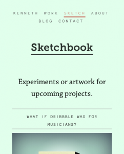
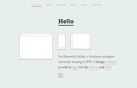
kennethcachia.com provides a truly dynamic experience. The design is very smart. The gallery portfolio pages have links to other works at the bottom of the page which creates a seamless flow from one project to another and eases the chore of moving through a large portfolio. The homepage is so simple and intuitive that I just love it. Who ever thought that a flashing link would look good? Redundant text and image linking is also very smart.
kennethcachia.com is both reductionist and lush; it has layers of subtly and detail that create a subdued and complex experience without piling superfluous elements onto the design. Lovely.

A truly great site. And, you guessed it! Responsive.


0 Comments