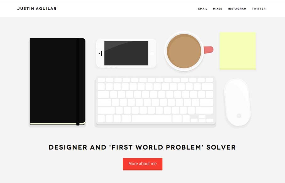
Really like Justin’s use of navigation, both in the Work section, and in the header. It’s different, active, animated, and gets away from the proverbial hamburger menu icon – which is always a good thing. The rest of the site is clean and crisp, with some good demos and downloads.
Glassmorphism: The Transparent Design Trend That Refuses to Fade
Glassmorphism brings transparency, depth, and light back into modern UI. Learn how this “frosted glass” design trend enhances hierarchy, focus, and atmosphere, plus how to implement it in CSS responsibly.


0 Comments