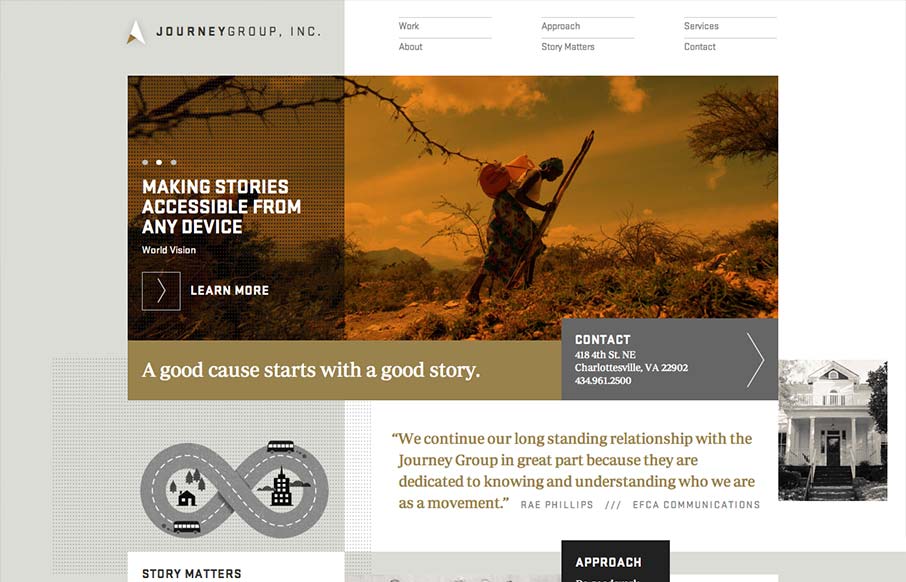
Order yet disorder. That’s how I like to think about this design. It starts off with this really strong grid feel and then the shapes and blocks of copy/images start to feel really asymmetrical and wonderful. I like the blocky vibe with the type and the flat colors give it a really nice upscale feel. It’s not fully responsive but I do dig the small screen size design here. Good work to review when you get a second or three.


The Call to Action, Revisited
The Call to Action hasn’t changed in a decade, but the bar has. A fresh look at prominence, copy, mobile tap targets, and accessibility, with lessons from three major design systems.


0 Comments