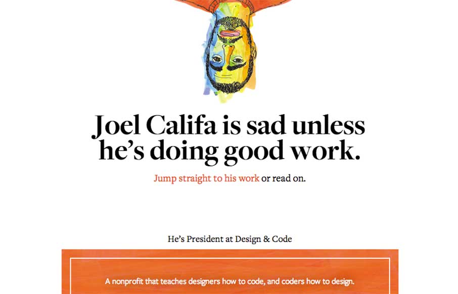
Theme of the day is clean and simple. Joel Califa’s portfolio site out of Brooklyn is exactly that. Love two main things: 1 – The “text-heavy portfolio” are really more than just “I did that” – there’s a ton of detail on HOW he did everything, completely referenced. Always good to see someone’s process – to learn from it, or to hire it. The portfolio posts are written like his blog posts, which probably helped in getting his new-er job at DigitalOcean. 2 – I like Joel’s head hiding on the blog – simple, but kind of funny.
Glassmorphism: The Transparent Design Trend That Refuses to Fade
Glassmorphism brings transparency, depth, and light back into modern UI. Learn how this “frosted glass” design trend enhances hierarchy, focus, and atmosphere, plus how to implement it in CSS responsibly.


0 Comments