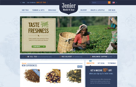
The feel of this site is as soothing as relaxing with a cup of tea. There’s a nice and balanced complementary color scheme and subtle textures and highlights throughout that add to the calming feel. I enjoyed the typography and small flourishes as well as the vivid photography used. It seems to be a fairly large site but I think they do a good job of guiding you through without getting lost or frustrated. Overall I think it’s a solid design and is appealing whether you’re a tea drinker or not.
Glassmorphism: The Transparent Design Trend That Refuses to Fade
Glassmorphism brings transparency, depth, and light back into modern UI. Learn how this “frosted glass” design trend enhances hierarchy, focus, and atmosphere, plus how to implement it in CSS responsibly.


I agree, Maria. This is a really soothing site, perfect for the subject matter and it has just enough of that ‘world market’ feel, if you know what I mean, without overdoing it. The only thing I wish is that it didn’t set so much text in images.
Those are also probably some of the best looking drop down nav design i’ve seen in a while.
Jay, that’s a perfect description for the overall feel – dang I should have thought of that!
Gene, I agree on the drop downs. I thought they are well utilized and the tucked detail is a nice touch.
Hi Everyone,
Thanks for your kind words. The designer, Kevin, worked really hard on this. This project was a whole new big exercise: branding, webdesign, packaging design and development, and we and our clients Jenier Teas, are really pleased that the design represents the brand so well. The menu was important…. as it is in every ecommerce site. If you think the site is good… wait until you taste the tea.. they sell internationally! : )