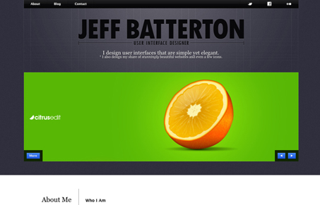
I like how there is a strong top-half and bottom-half in this website design. The heavy top with the slideshow and dark gray background really offsets the bottom-half with it’s white background and obvious 4 column grid.
Glassmorphism: The Transparent Design Trend That Refuses to Fade
Glassmorphism brings transparency, depth, and light back into modern UI. Learn how this “frosted glass” design trend enhances hierarchy, focus, and atmosphere, plus how to implement it in CSS responsibly.


0 Comments