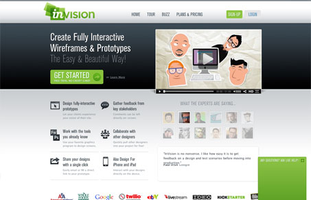
I really like the Invisionapp.com website design, it’s also a pretty swell prototyping tool. It’s clean and sells visually that the app is solid. There’s a clear call to action and the colors used really make it consistent across the page. It has a very well thought out tag-line and there are some nice twitter avatars of some well known web designers giving testimonials on the app. Very strong.
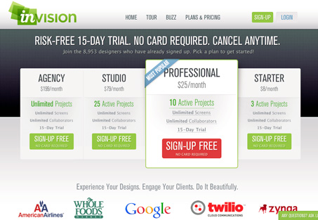
What I like most is the sign up experience. It’s nothing that blows you away it’s just a clinic in a well done signup experience. From the main app package selection page they’ve made you aware of the “best fit” package. They also have that nice micro-copy telling you that you can signup without your credit card – that’s a super nice way to set the tone of the relationship you’re about to get into with this app/company as a user.
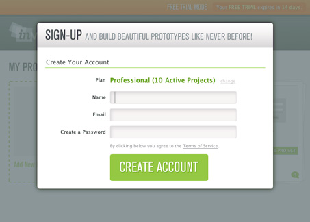
I really like the signup form page a lot. Showing you a hint of the app behind the form is really smart. It shows you just how close you are to using the app – even if it’s kinda faked out or whatever that’s a really nice touch. Love it!


Great points on the sign up process and the form. Details like that are easily overlooked and when you get past the shock and awe of a site, those are the things that truly have an impact.
Agreed. This site is amazing. It’s so great that i’m seriously considering purchasing the product for my next project. Seriously.
A testament to brilliant design.
Great! Hey, if you do tell them UMS sent you! 🙂
@Gene – will do!