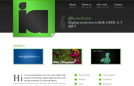
That’s about the biggest logo i’ve ever seen on a website. That said, I love it. Strong and bold, those shapes are just nice to look at. The header design on this website is really sticking in my brain. There isn’t very much content to sink into on this site outside of the work samples but overall it’s a nice design.
Glassmorphism: The Transparent Design Trend That Refuses to Fade
Glassmorphism brings transparency, depth, and light back into modern UI. Learn how this “frosted glass” design trend enhances hierarchy, focus, and atmosphere, plus how to implement it in CSS responsibly.


0 Comments