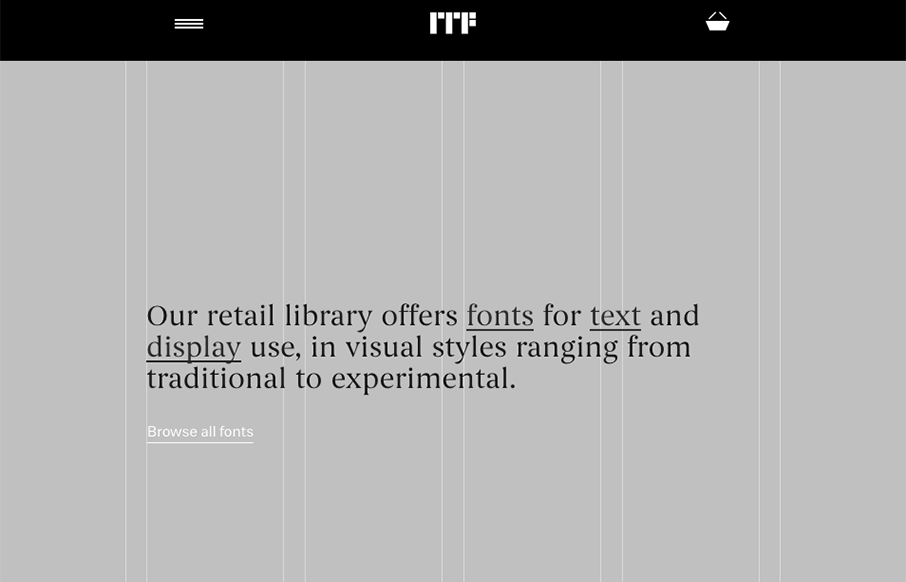
Super cool, at first glance, standard looking website design. As you scroll around and start checking things out, you get hit with some pretty cool little interactions. Like the mouse overs and then those fly-out nav items on the cart and login. Super cool way to approach that.
Glassmorphism: The Transparent Design Trend That Refuses to Fade
Glassmorphism brings transparency, depth, and light back into modern UI. Learn how this “frosted glass” design trend enhances hierarchy, focus, and atmosphere, plus how to implement it in CSS responsibly.


0 Comments