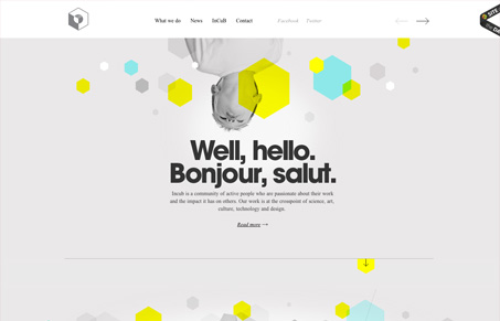
Very nice clean and crisp looking design. I love the sharpness to this layout and all the details like the quality of the arrows and imagery. I find the sideways navigation experience to be a little disjointed. I do think it’s working well enough as used here, since the site has limited pages and section depth, but it seems like it takes too long to get a good mental model of what’s behind each scroll down or click over to the right. Overall it’s well executed, the speed of transitions feels perfect and the design elements that indicate pages are not at all out of place. What do you guys think?


0 Comments