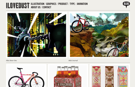
I like the hierarchy in the large to small images as you look down the page. The simplified layout is strong and efficient. The top navigation is a bit overly simple but it works. I don’t really get the loading screen on this site, it seems unnecessary to me. Good looking gallery style website here.
Glassmorphism: The Transparent Design Trend That Refuses to Fade
Glassmorphism brings transparency, depth, and light back into modern UI. Learn how this “frosted glass” design trend enhances hierarchy, focus, and atmosphere, plus how to implement it in CSS responsibly.


0 Comments