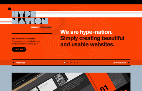
Nice use of the red and black here. I like the feel of the blocky type and nice thin lines in all the underlying shapes. I do feel like there’s a sense of split focus on the top-half of the page and the big slideshow setup. They even do a scroll-down focus when you click the next link in the slideshow. I feel like the visitor could stand to see a little more info on the company or people behind hype-nation than this single page gives us. Overall though, this is a nice looking single page design with strong and bold visual appeal.


0 Comments