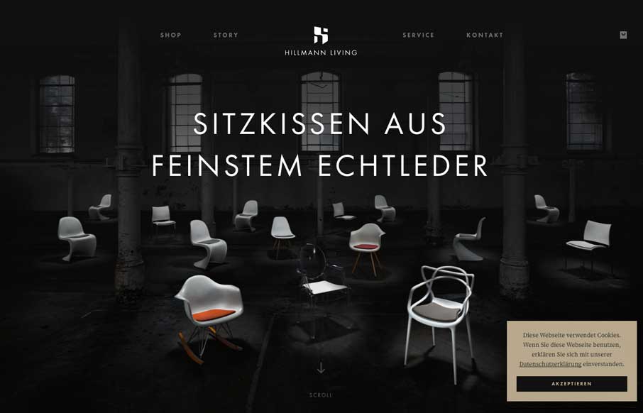
Nice clean layout for the Hillman Living website. I love the way the image fades in with those color chairs on that dark background. Cool effect there. I also like the way the first section of product images are worked onto the page. It’s chock full of visual interest where typically just a simple square image would be used. Draws me in.
HILLMANN LIVING is dedicated to designing and developing unique products through the power of design and experience. We are happy to announce the launch of the brand new ecommerce website.
Created by web://contact


0 Comments