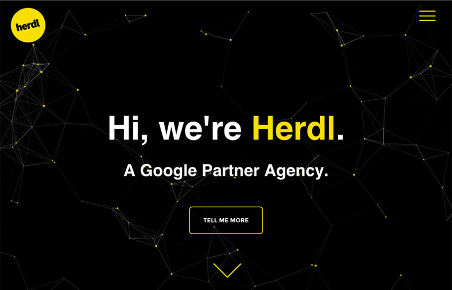
Nice minimal site from Herdl out of the UK. Minimal because they hit you with headlines on the front page, instead of a lot of words (that your potential client never reads anyway… no… really). There’s meat in the Services pages – but the home is simple, but with some interactive features for clients to go “cool”.
From the Designer: A striking website design for a young and energetic digital marketing agency.
Submitted by: Sam Day
Twitter: @herdl
Role: Designer & Developer
Country: United Kingdom


0 Comments